October 19, 2008
May 26, 2008
Photoshop Rose Part 2

May 16, 2008
I'm Back

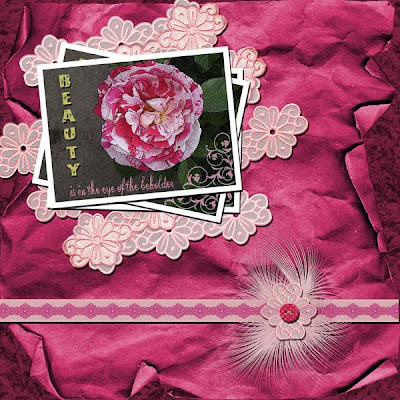
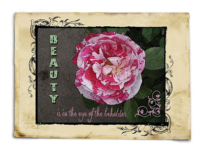
I haven't been posting to my blog lately, but that doesn't mean I haven't been hard at work (well, it's NOT work to me) creating all kinds of fun things. Today I'm sharing with you a photo I took a few weeks back and gussied up a bit in Photoshop Elements. The Artistic Filter is called Poser Edges and it gives the photo an "artsey" look to it. I get a lot of my PSE tips from ScrappersGuide.com. Check it out. Linda Satgast is an excellent teacher if you're trying to learn digi scrapping.
April 4, 2008
Subscribe to:
Posts (Atom)


